LVGL object
LVGL is an open-source graphics library written in C that provides a set of functions and widgets to create user interfaces for various platforms, including microcontrollers, development boards, and other embedded systems.
An “object” in LVGL refers to a graphical element or widget that can be displayed on the screen and interacted with by the user. LVGL provides a variety of pre-built objects/widgets that can be used to create a wide range of UI elements.
LVGL object
- In LVGL, the basic building blocks of a user interface are the objects, also called Widgets.
- For example, a Button, Label, Image, List, Slider, Switch, Checkbox, Keyboard, Chart or Text area or just a base object.
- All objects are referenced using a lv_obj_t pointer as a handle.
- This pointer can later be used to set or get the object’s attributes.
- For example, button and label both are lvgl objects of type lv_obj_t, but button objects may carry some unique attributes that label objects may not have.
- ‘Base object’ is also a lvgl object or a widget that doesn’t carry any special attributes.
Please note that all the points discussed here are taken from the LVGL official documentation, specifically version 8.3. For more detailed information, it is recommended to refer to the LVGL documentation.
In LVGL, each object (widget) has a set of attributes that define its appearance, behavior, and other characteristics.
These attributes can be divided into two main categories: Basic attributes and Special attributes.
- Basic Attributes:
- Applies to all objects of types lv_obj_t
- You can set/get these attributes with lv_obj_set_.. And lv_obj_get_..functions.
- Example:
- Position (x, y): The x and y coordinates that define the object’s position on the screen relative to its parent. The top-left corner of the parent is the reference point (0,0).
- Size (width, height): The width and height of the object. It determines the object’s dimensions on the screen.
- Style: The visual appearance of the object, such as color, font, border, background, etc. LVGL allows you to customize the style of each object to match your desired design.
- Parent: Each object belongs to a parent container (such as a screen, window, or list). The parent-child relationship helps organize the objects in a hierarchical structure.
- Event Handler: Each object can have event handlers associated with it. These handlers are functions that get called when specific events occur on the object, such as a button press, slider value change, etc.
- Hidden: A flag that determines whether the object is visible on the screen (true) or not (false). You can use this attribute to show or hide objects dynamically.
- Clickable: Determines whether the object can be clicked or interacted with by the user (true) or not (false).
- Special Attributes:
- The object types have special attributes too. For example, a slider has
- Minimum and maximum values
- Current value
- The object types have special attributes too. For example, a slider has
- Example:
- Text: For text-based objects like labels, buttons, and text inputs, this attribute stores the content or label displayed on the object.
- Value: For objects like sliders, spin boxes, and other widgets that represent a value, this attribute stores the current value of the object.
- Options: For objects like dropdowns and lists, this attribute holds the list of available options that the user can choose from.
- Checked: For objects like checkboxes and switches, this attribute stores whether the object is currently checked (true) or unchecked (false).
- Image Source: For image objects, this attribute contains the image data or path to the image file that should be displayed.
- Action: Some objects may have special actions associated with them, such as calling a function when the object is pressed or activated.
- Range: For objects like sliders, progress bars, and gauges, this attribute defines the minimum and maximum values allowed for the object.
- Alignment: For text-based objects, this attribute determines the alignment of the text within the object (e.g., left, center, right).
- Scrollbar: For scrollable objects, this attribute controls the visibility and behavior of the scrollbar.
- For these special attributes, every object type may have unique API functions.
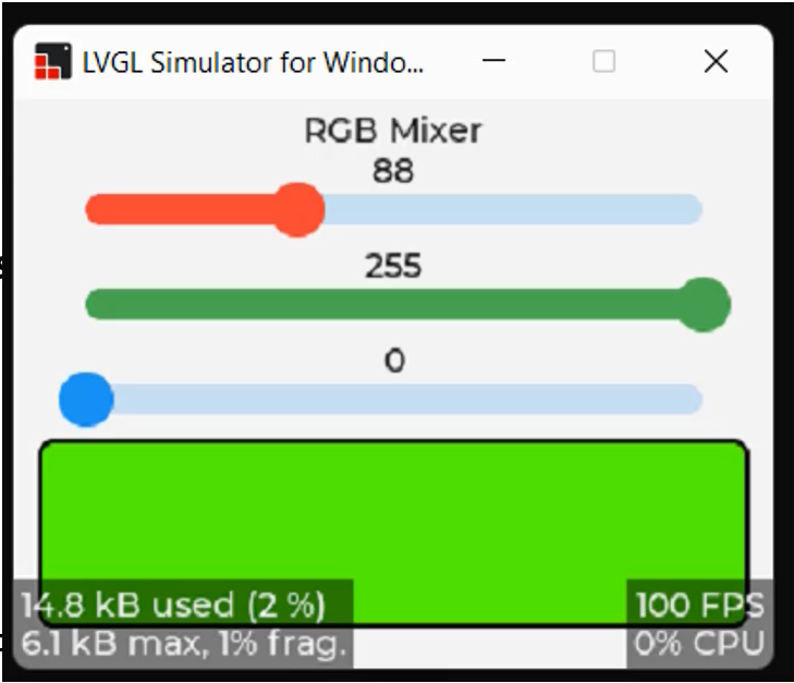
In Figure 1, we can observe three sliders. Sliders have special attributes such as range, starting value(0), ending value (here like 255)( also known as Max and Min values). These attributes are referred to as ‘special’ because they provide unique functionalities specific to each object type.
For instance, buttons may have their own set of special attributes, while labels may have different ones. Each object type in LVGL has its own distinct special attributes. For instance, sliders have their specific API functions to manipulate these attributes. If you wish to modify these special attributes, you can refer to the widget section in the documentation. There, you will find the relevant APIs to change (i.e., set or get) the specific attributes for that particular object type.
A screen object
- When you register a display driver with lvgl, lvgl creates a ‘screen’ object of type lv_obj_t.
- This screen object is a parent object to which you can add your application-specific child objects.
- The screen object is associated with the display object of type lv_disp_t.
- There will be one display object for each physical display. For example, if you are using 2 physical displays, there may be 2 display objects. LVGL provides dedicated APIs to change the properties of the display
- lv_disp_set_rotation()
- lv_disp_set_default()
- lv_disp_get_default() and many
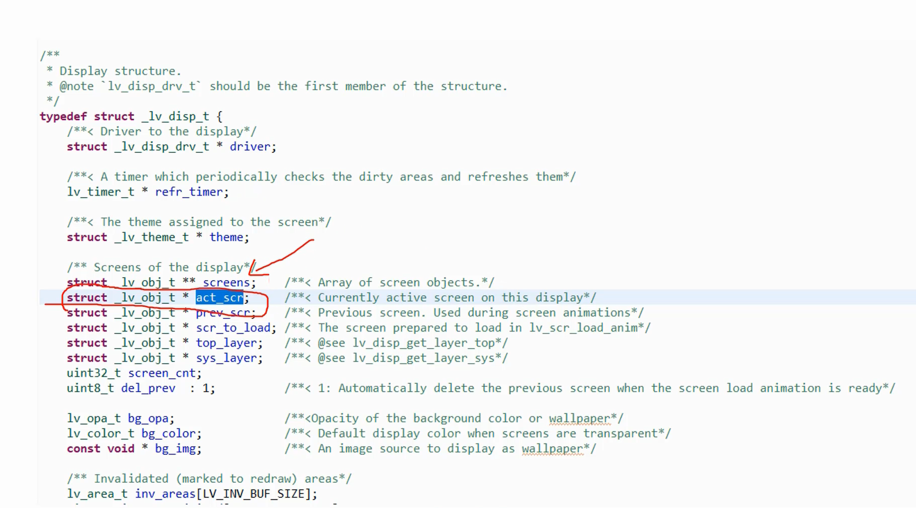
- Each display can have many screen objects, and the current active one is accessed by the field act_scr of the display object.
- You can manipulate screen objects by these APIs.
- Get the active screen lv_scr_act()
- Load screen lv_scr_load(scr1)
In Figure 2, you’ll notice the lv_disp_t structure, which includes a field called act_scr (active screen). This field represents the currently displayed screen on this particular display. Additionally, you can attach multiple screens to a display, creating an array of screen objects. To switch to a new screen, you can utilize a specific function designed for this purpose.
Widgets
You can create many widgets for your application.
In the documentation, there are many Core widgets like button, canvas, checkbox, dropdown menus, images, label, line, sliders, switch, etc. All these are Core widgets and also there are some special widgets. You have to refer to the documentation to understand the APIs related to these widgets.
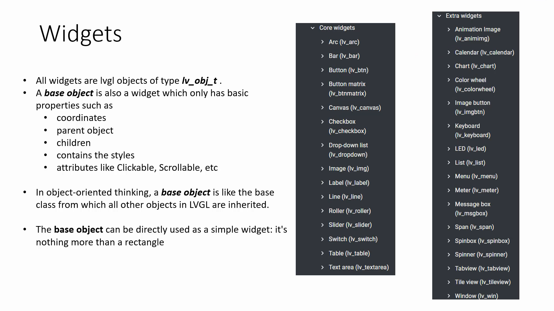
For example, if you want to understand how to create a button widget, you should refer to the ‘Button’ section. In this section, they explain how a button looks, its properties, its parts, and the APIs used to handle buttons.
Widgets are nothing but lvgl objects of type lv_obj_t. A base object is also a widget, which only has basic properties like coordinates, parent, style, etc.
In object-oriented thinking, a base object is like the base class from which all other objects in LVGL are inherited.
The base object can be directly used as a simple widget: it’s nothing more than a rectangle.
Exercise 003: RGB Mixer
- Test using the simulator
- Test on hardware
- Create a new STM32CubeIDE
- Add all the required peripherals using IDE’s device configuration tool, LVGL and LVGL display, touchscreen drivers as explained in the previous exercise
- Copy simulator tested code and test on the hardware
Let’s do this exercise in Following article.
FastBit Embedded Brain Academy Courses
https://fastbitlab.com/course1

